CRAIG UI — Current-State Reference
On this page
Snapshot of what CRAIG’s UI looks and behaves like today. Lives alongside ui-philosophy.adoc (durable principles + constraints) — this doc is the descriptive complement.
Last updated: 2026-06-08. This doc drifts as code evolves. The screenshots regenerate via SCREENSHOTS=1 cargo xtask e2e — screenshots.spec.ts (writes to docs/modules/ROOT/images/screenshots/); the token + component-pattern tables should be refreshed when services/craig-web/static/css/ changes substantially.
Status
| Section | Description | Status |
|---|---|---|
1 |
Visual identity (current token values) |
Done (2026-06-08) — refresh when |
2 |
Component patterns (what exists) |
Done (2026-06-08) — refresh when component CSS changes substantially |
3 |
Accessibility posture (what’s there + gaps) |
Done (2026-06-08) — refresh when a11y gaps close or new ones surface |
4 |
Pain points (designer-relevant) |
Done (2026-06-08) — items drop off as we address them |
5 |
Screenshot inventory |
Done (2026-06-08) — regenerate via |
6 |
Reading guide (live staging walkthrough) |
Done (2026-06-08) — refresh when routes change |
1. Visual identity — current token values
Structural tokens (typography, layout) live at services/craig-web/static/css/tokens.css; since Plan U Step 8 (ADR-036) the per-jurisdiction color palette is served from the active state bundle’s /assets/theme.css, with the canonical token names + values in the Theme Token Schema (locked 2026-06-14). The values below are the pre-lock Georgia Orchard snapshot, retained for design-engagement context; the Token Schema is the durable source of truth.
Brand palette
| Token | Hex | Use |
|---|---|---|
|
|
Dark green; primary action color, link color, active state |
|
|
Hover state for primary |
|
|
Gold; brand-only (logos, page-header strip); never functional UI |
Surface palette (light mode)
| Token | Hex | Use |
|---|---|---|
|
|
Page background (slightly tinted) |
|
|
Cards, modals (lift off page) |
|
|
Wells, alternating rows, table headers |
|
|
Body text (deep near-black) |
|
|
Secondary text — darkened sage so it clears WCAG AA on white at 12px |
|
|
Default border / rule color |
Semantic palette
| Token | Hex | Use |
|---|---|---|
|
|
Warmer terracotta (sits in the family; not jarring) |
|
|
Brighter green (distinct from |
|
|
Amber (distinct from |
|
|
Muted teal |
Dark mode (placeholder — needs refinement)
| Token | Hex | Notes |
|---|---|---|
|
|
Green-undertone dark |
|
|
|
|
|
|
|
|
Desaturated so it doesn’t vibrate against dark bg |
Engineer-tuned. Works; not refined. Treat as a starting reference.
2. Component patterns
Buttons
-
.btn—primary(green fill, white text) -
.btn—secondary(white fill, green text + border) -
.btn—danger(red fill) -
Sizes: default +
.btn—sm -
No documented icon-button variant
Badges (status indicators on table rows)
-
Named per status:
.badge—open.badge—done.badge—pending.badge—icwa -
Text labels with CSS background colors
-
No icons committed yet
Forms
-
Layout class:
.form-row(horizontal grouping),.form-input(input element),.form-label(label element) -
Error display: block-level at top of form section — NOT field-attached via
aria-describedby(a11y gap; tracked) -
No reusable form-component library — each domain (cases, placement, financial) re-implements its own forms with subtle drift
Tables
-
Sortable + searchable + resizable via Alpine.js (
data-table data-table—resizable) -
Sortable column headers click-to-sort; URL query param updates
-
Resizable column borders are draggable
-
Pagination via reusable
_pagination.htmlpartial (preserves filter context) -
Cross-domain divergence: cases-list uses
data-table—resizable; placement-matching uses plain rows without the class — patterns drift across domains
Navigation
-
Top chrome with role-gated nav (see
services/craig-web/templates/base.html) -
aria-current="page"on active nav links -
Breadcrumb pattern with
aria-label="breadcrumb"+aria-current="page"on last item -
Avatar pill bottom-right (initials in a circle;
role="img"+aria-label)
Tab UI
-
Alpine.js-driven;
role="tablist"/role="tab"/:aria-selectedbinding /@keydown.enterfor keyboard nav -
Used heavily on case detail (5 tabs: Summary / Contacts / Court / Plans / Household)
-
Tab content swap is client-side (no server round-trip per tab)
Modals + dialogs
-
Few in current UI (mostly confirmation prompts)
-
Alpine
x-show+x-transition -
No focus trap (a11y gap)
-
No return-to-trigger focus on close (a11y gap)
Flash messages
-
Top-of-page band; success / warning / error variants
-
x-data="{ show: true }" x-show="show" x-transitionfor dismissal -
role="alert"for screen-reader announcement
Empty states
-
No reusable pattern. Each list/table either shows nothing, a one-liner ("No cases found"), or a one-off "Create your first case" CTA — inconsistently.
-
Designer opportunity: establishing a reusable empty-state pattern is high-leverage.
3. Accessibility posture
What’s there
| Category | Status |
|---|---|
Landmark roles |
|
ARIA usage |
~60 |
Keyboard interaction |
Tab UI: |
Form labels |
|
Screen reader |
Tested informally on NVDA + VoiceOver during development; not part of regular test pass |
Reduced motion |
Not respected ( |
Known gaps
| Gap | Severity | Status |
|---|---|---|
No focus trap on modals |
Medium |
Known; design-system foundation work will resolve |
Form errors not linked via |
Medium |
Known; affects every form |
Tables don’t use |
Low |
Native |
No keyboard-shortcut model |
Medium |
Track 5 / command palette will resolve |
No |
Low |
Quick fix; add when design-system motion tokens land |
Color-only state in some badges |
Low |
Audit + add icons or patterns alongside color |
4. Designer-relevant pain points
Things that bug us about the current UI — places where design attention has highest leverage:
-
Table patterns drift across domains. Cases list looks slightly different from placement homes list looks slightly different from financial payments list. Unifying these tightens the whole product.
-
Form-component reuse is low. New form added each domain; each re-implements the same input layouts and validation rendering. A canonical form-component library would save weeks of future engineering AND make every form better.
-
Case detail feels cramped. 5 tabs cram the case-management surface into a thin band. Composability is the target (§ Composability direction).
-
No dashboard. Users land on a per-domain list (
/casesor/intake/worklist); the "what needs my attention today" panel doesn’t exist. Single highest-impact addition. -
Placement matching is the densest single screen. Bipartite matching of children → homes; lots of attributes; current UX is rough.
-
Federal-reporting workflows (AFCARS / NCANDS) are dated. Multi-step wizard pattern; works but feels like 2014.
-
Rate-setting in financial domain is unique. Multi-period rate tables with overlapping effective-date periods; the current editor doesn’t handle this gracefully.
-
No consistent empty-state design. Lack of reusable empty states means every screen rolls its own — or shows nothing.
-
Audit log surface is thin. Filterable table of events; visually undistinguished.
5. Screenshot inventory
Live screenshots committed at docs/modules/ROOT/images/screenshots/ (git-LFS-tracked). Regenerate via:
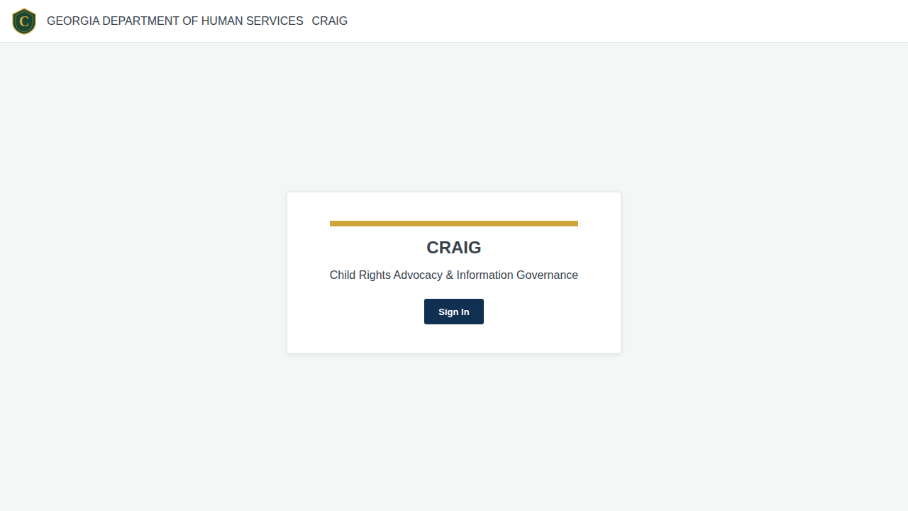
SCREENSHOTS=1 cargo xtask e2e --no-refresh -- screenshots.spec.tsLast regenerated: 2026-06-08. 47 PNGs covering public intake (8 screens) + caseworker UI (14 screens) + admin (24 screens) + login (1 screen).
Public intake (8 screens)
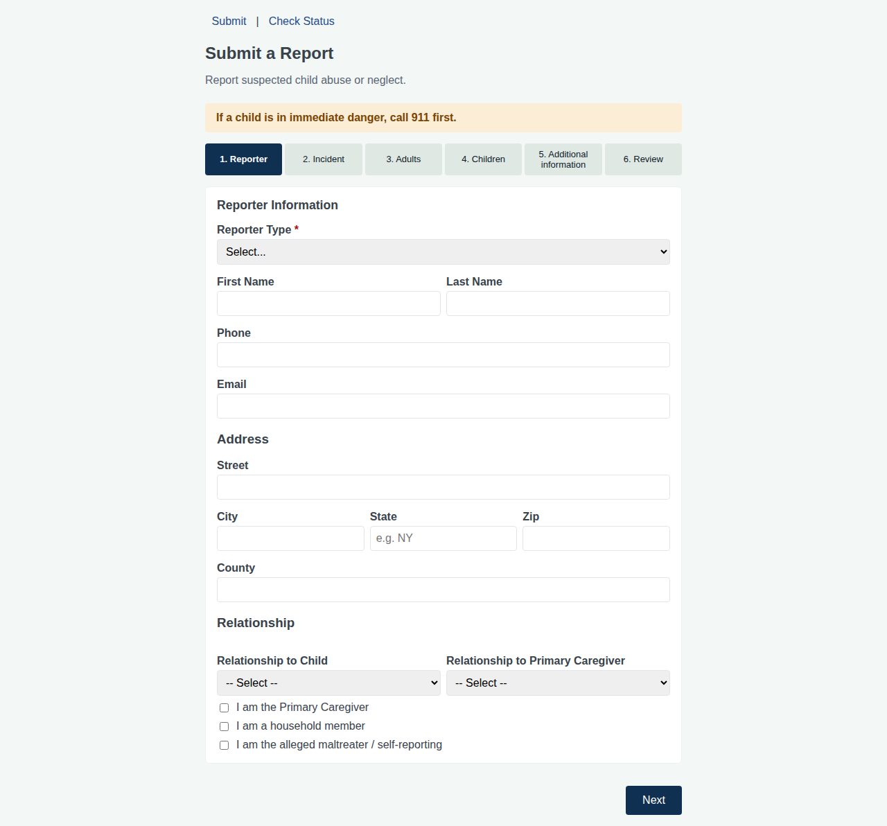
01-report-form.png — public submission form, step 1
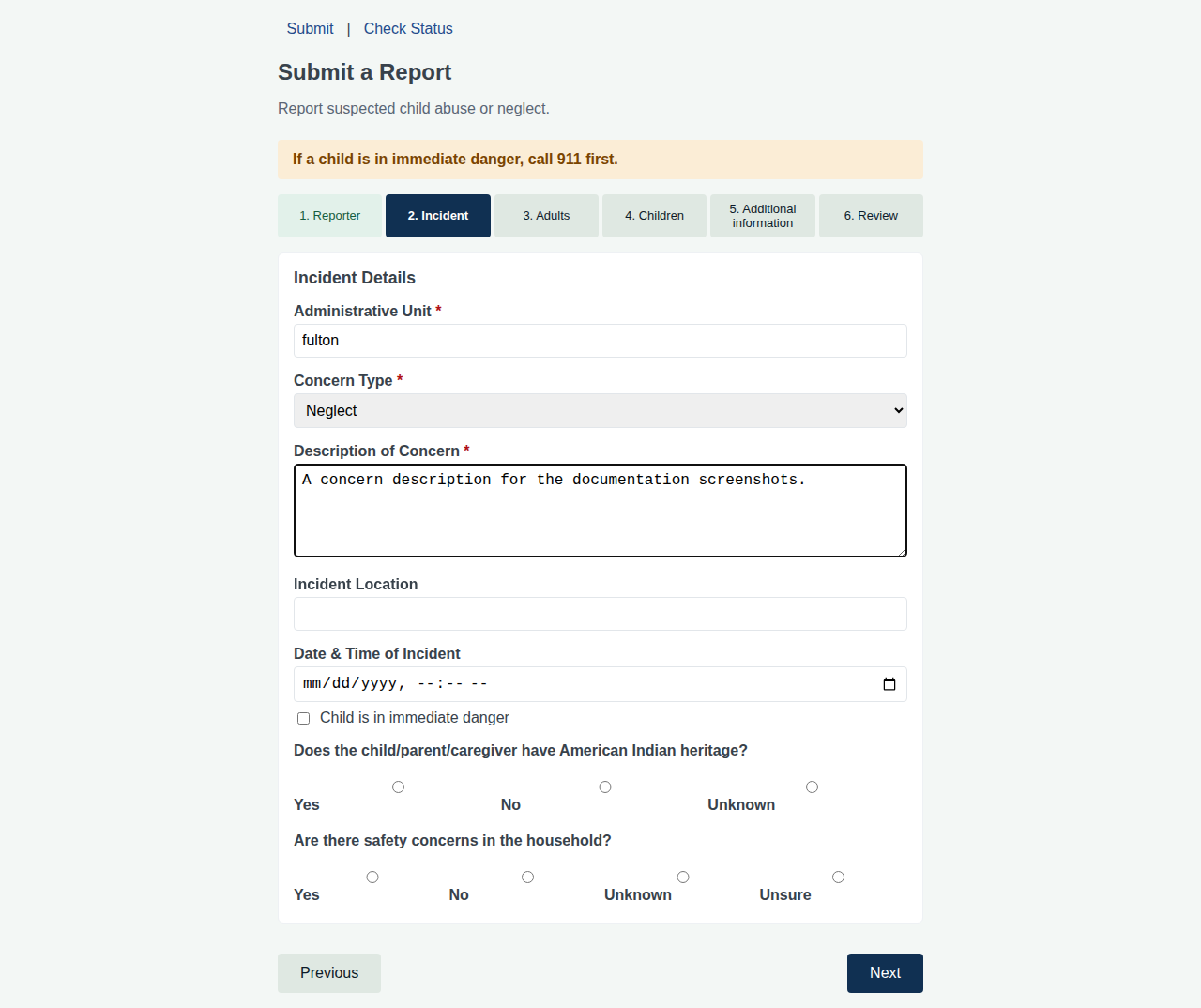
02-report-incident.png — incident details
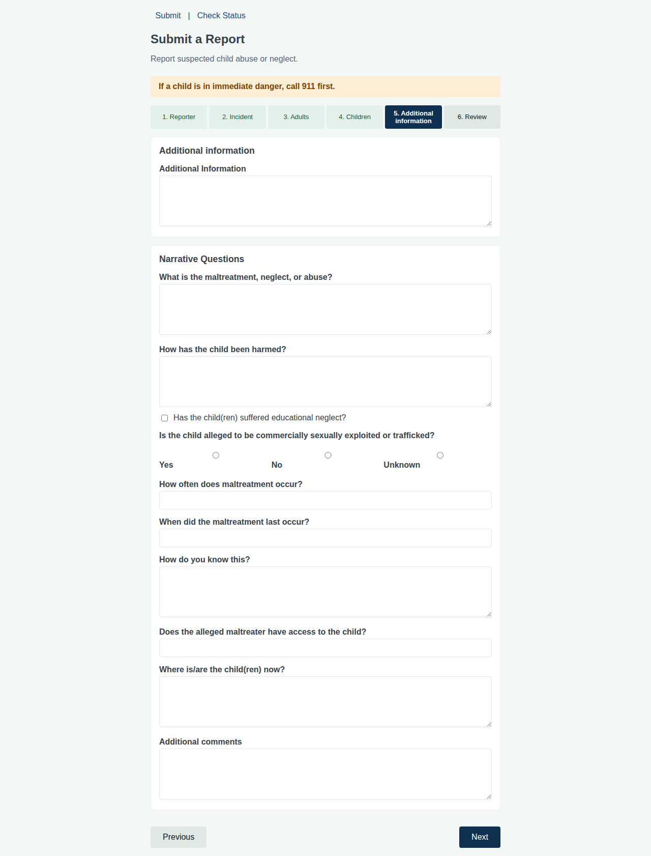
05-report-additional.png — additional information (narrative subtrees live here)
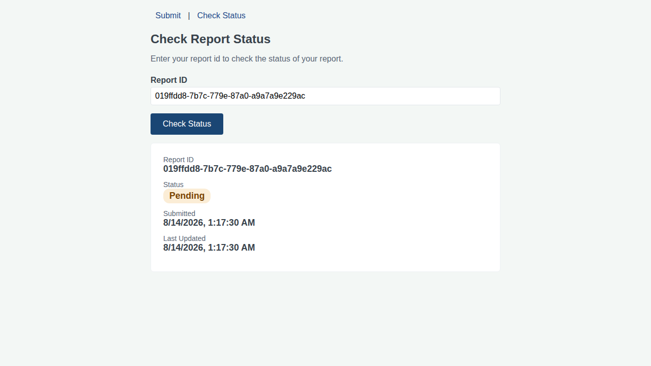
07-report-status.png — confirmation-code status lookup
Additional intake screens: 03-report-adults.png, 04-report-children.png, 06-report-review.png, 08-report-keys.png.
Caseworker UI — high-value screens
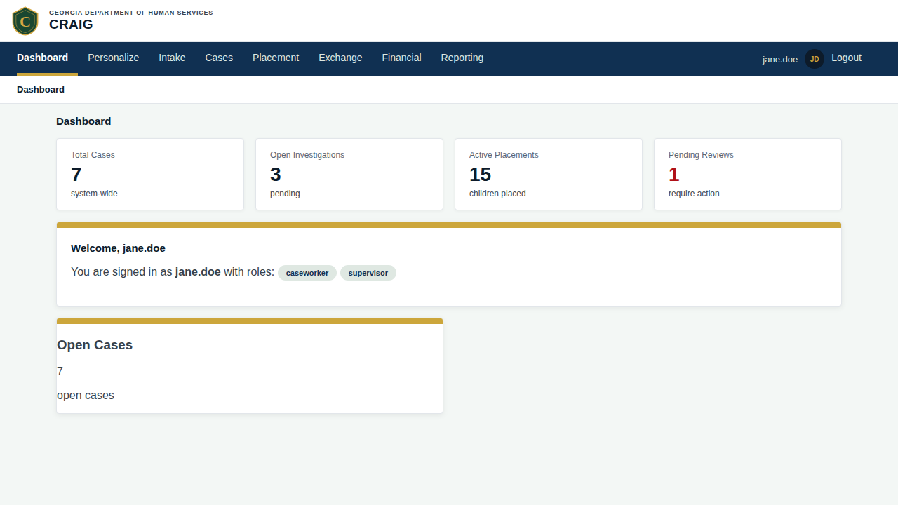
10-dashboard.png — current caseworker landing (no dashboard panels; lands on cases list)
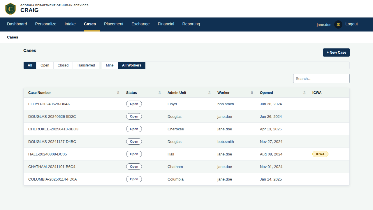
11-case-list.png — sortable + searchable cases list; representative of the table pattern
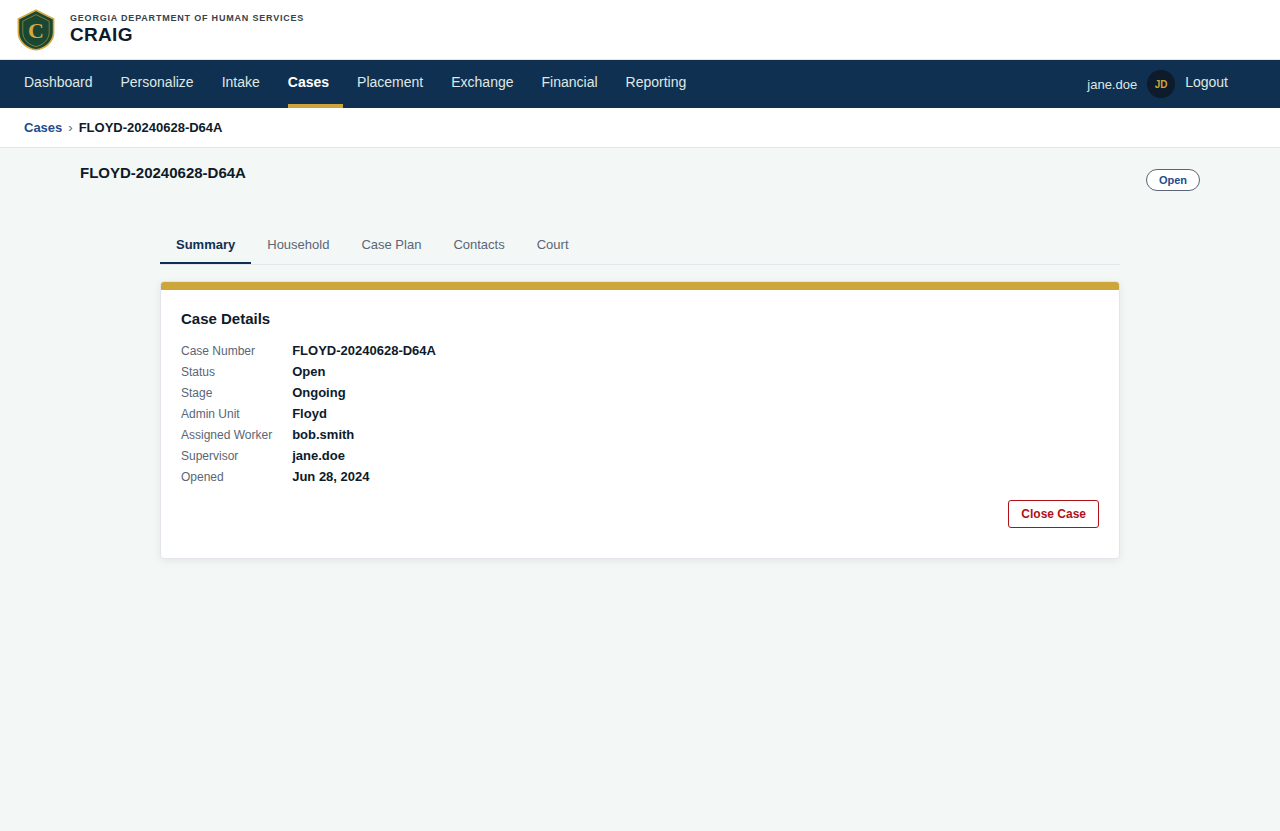
12-case-detail.png — case detail with 5 tabs (Summary / Contacts / Court / Plans / Household); the cramped-feeling surface
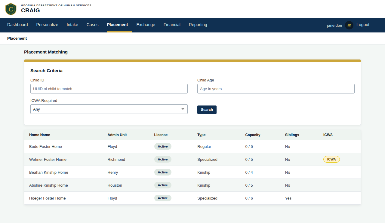
23-placement-matching.png — the densest single screen; bipartite child-to-home matching
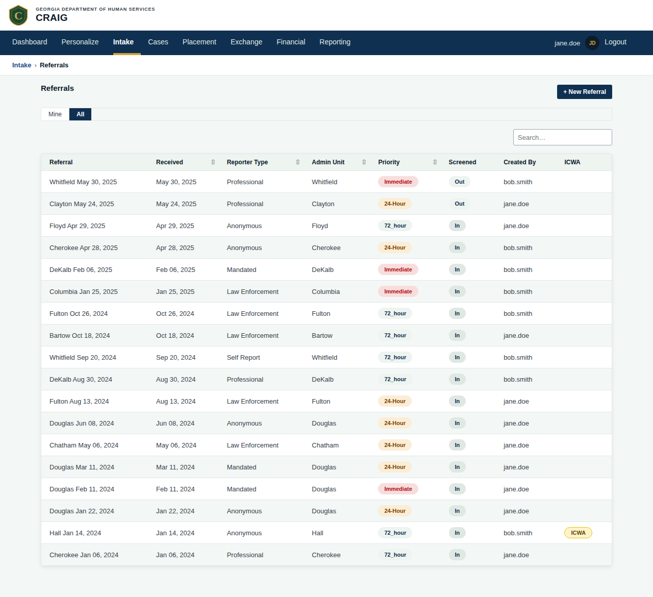
14-referral-list.png — intake referral worklist
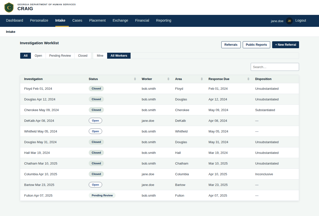
16-investigation-worklist.png — open investigations awaiting attention
Additional caseworker screens: 13-case-new.png, 15-referral-detail.png, 15a-referral-new.png, 17-investigation-detail.png, 17a-safety-assessment.png, 18-report-review-queue.png, 18a-report-detail.png, 20-foster-home-list.png, 21-foster-home-detail.png, 21a-foster-home-new.png, 22-placement-list.png, 22a-placement-new.png.
Admin — high-value screens
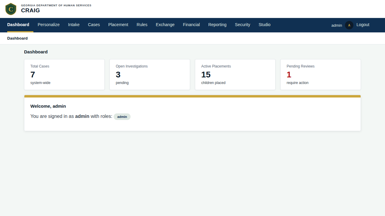
30-admin-dashboard.png — admin landing surface
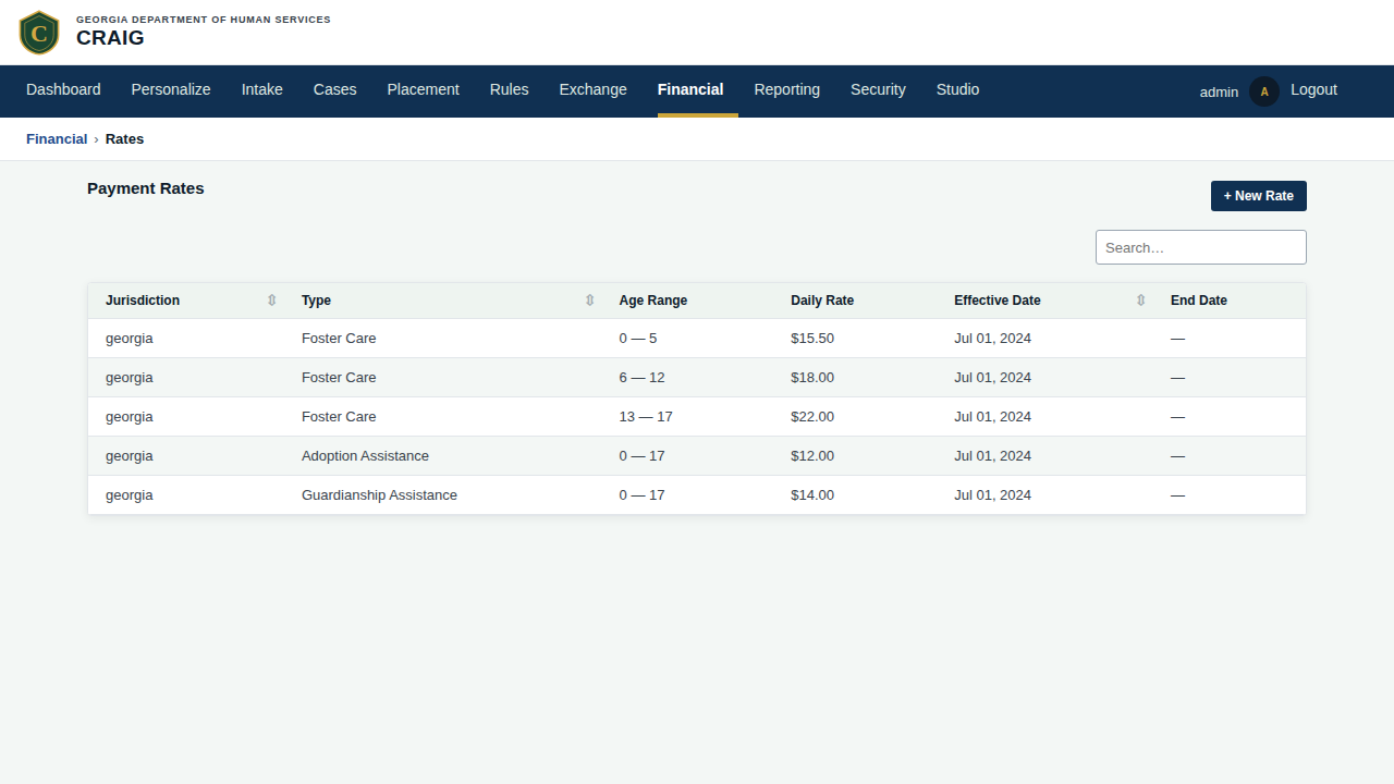
38-financial-rates.png — multi-period rate-setting editor; the overlapping-effective-date pain
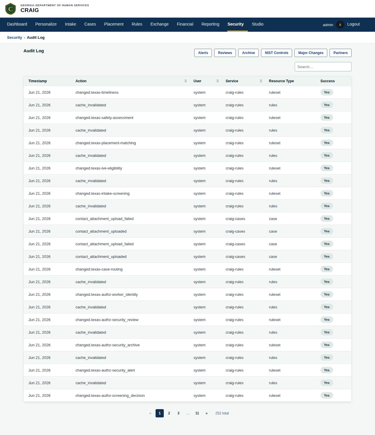
41-security-audit.png — filterable audit-event table; visually thin
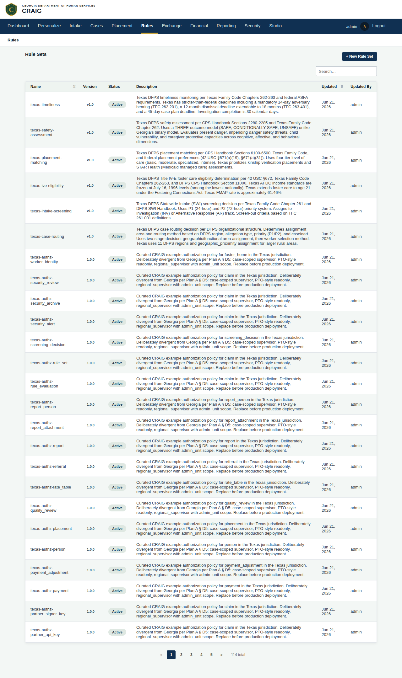
40-rules-list.png — JDM ruleset list; admin-only
Additional admin screens: 31-exchange-partners.png, 32-exchange-partner-detail.png, 32a-exchange-partner-new.png, 33-exchange-agreements.png, 34-exchange-transactions.png, 35-icpc-requests.png, 35a-icpc-detail.png, 36-financial-payments.png, 37-financial-payment-detail.png, 38a-financial-rate-new.png, 39-financial-claims.png, 39a-financial-claim-detail.png, 40a-rules-detail.png, 42-security-reviews.png, 43-security-archive.png, 44-security-nist.png.
6. Reading guide — live staging walkthrough
When designers (or new engineers) are walking the live UI for the first time, this is the suggested route order. Get a read-only staging user from the engineering lead.
| URL | What you’ll see | What to look for |
|---|---|---|
|
The live-stats dashboard (parallel fan-out tiles + the ADR-035 composed panel grid) |
The Track-4 dashboard landed; the composed panels are the ongoing surface to shape |
|
Cases list, sortable + searchable |
Most-used surface; tighten this and you tighten the product |
|
Case detail with 5 tabs |
The cramped-feeling case detail (pain point #3) |
|
Placement matching screen |
Densest single screen; data-heavy UX challenge (pain point #5) |
|
Intake referral worklist |
Consider whether it should be a dashboard panel rather than standalone |
|
Rate-setting table |
Multi-period overlapping-effective-date editor pain (pain point #7) |
|
Payment authorization form |
Representative financial form |
|
AFCARS federal report workflow |
Multi-step wizard pattern; dated (pain point #6) |
|
Audit log filterable table |
Visually thin (pain point #9) |
|
Partner integration management |
Admin surface |
|
Constituent submission form |
1990s government-form aesthetic (public surface — separate redesign) |
craig-intake — public submission UI (separate surface)
Tiny surface, deliberately:
-
2 HTML pages:
report.html(submission form),status.html(confirmation-code lookup) -
3 JS files (CSP-safe Alpine factories + Alpine.js minified)
-
1 CSS file (
intake-public.css) -
No authentication required for submission
-
CAPTCHA-gated
-
Returns a confirmation code on submit; user can later look up status
What it looks like today: generic government form. Functional. Cold. Not welcoming. Greenfield redesign per philosophy doc § role architecture + portal plan.
References
-
UI Philosophy — durable principles + constraints + multi-jurisdictional model + composability target
-
UI Module Map — role + module matrix
-
Portals plan — unbuilt portal scope
-
Code:
services/craig-web/static/css/(tokens + chrome + components + screens) -
Code:
services/craig-web/templates/(Askama templates) -
Code:
services/craig-web/static/themes/<jurisdiction>/(per-jurisdiction overrides) -
Screenshots:
docs/modules/ROOT/images/screenshots/(regenerable viacargo xtask e2e)